Concept for Firefighters' PrePlanner
The Prompt
We needed to design for firefighters while keeping in mind infrastructural drift: a design may encourage dependencies that are dangerous when that technology is no longer available or fails. Could the design be "soften" a firefighter's training to cope with the unexpected?
Furthermore, we were told this solution could be integrated with Resc.info 's Firebrary, an in development, open database firefighters that could leverage. What the interface was, how it worked in detail, and how it could be used was left ambiguous.
The Team
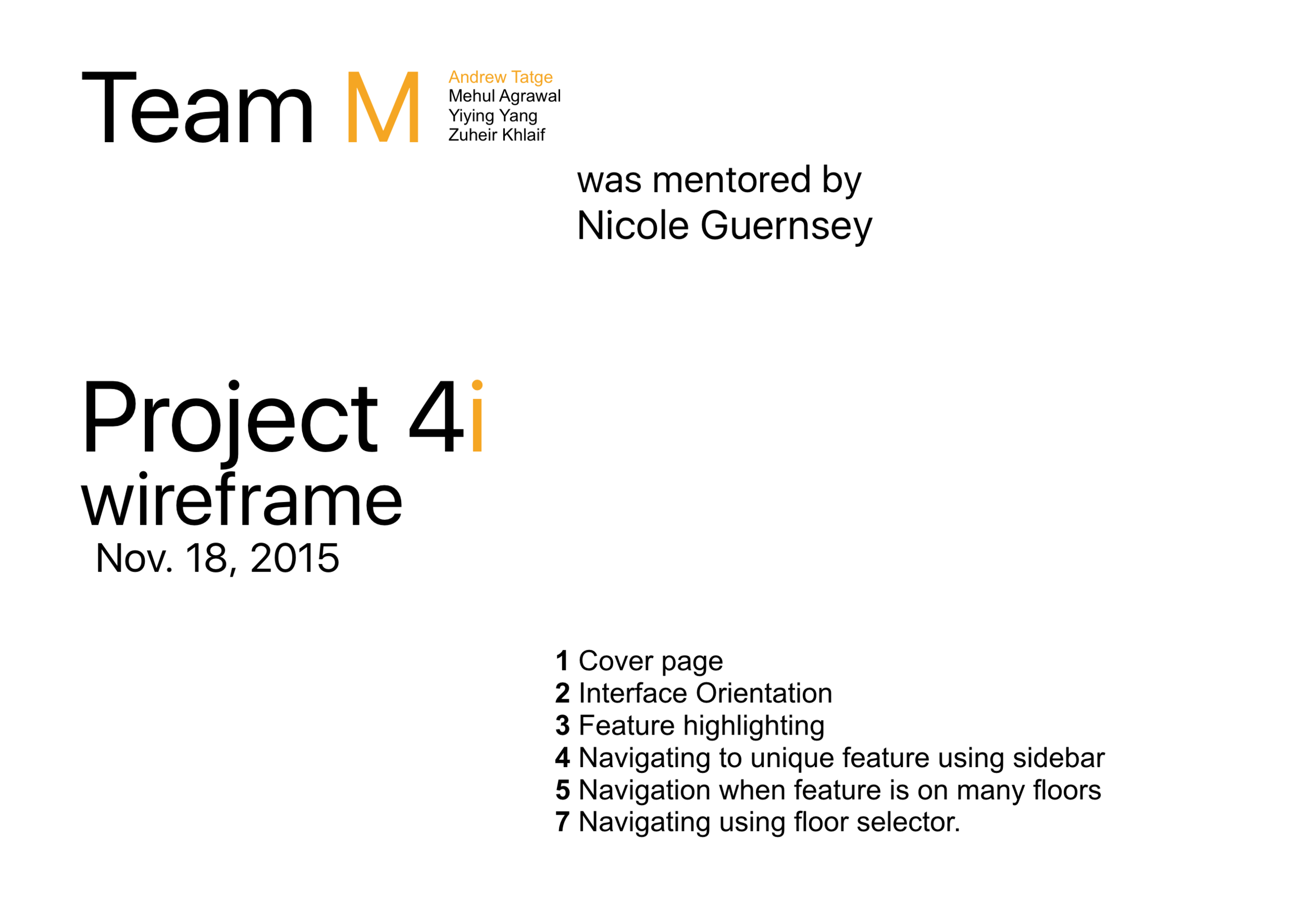
Mehul Agrawal Yiying Yang Zuheir Khlaif Andrew Tatge
FACILITATING
I was the facilitator for our team. This project was structured so that committees of 4 team facilitators had to agree on deliverables for all their teams. This made me appreciate legislators and middle–managers; it was fun but sometimes stressful balancing my team's preferences with other facilitators' preferences. As a committee we found common ground in requiring a "use case" to practice our storytelling abilities, but leaving the particular form up to each team.
DIVISION OF LABOR
Early on each member conducted primary research in larger groups of different team members. Near the end of the project:
- Mehul created our powerpoint and many of the assets depicting the design's UI in the video and documentation. A lot of these were based on hand drawn sketches by Yiying.
- Yiying created the document deliverable, and presented the design to the cohort by herself [ask me about doom cards!]. She also created the initial paper prototypes and ran usability tests while I documented them. Yiying helped me with photoshopping of individual frames I had created for our movie.
- Zuheir had to attend conferences and work more on his PhD towards the end of the project and was not as available after the research phase.
- I storyboarded, animated, edited, made assets for, wrote and narrated the use case video.
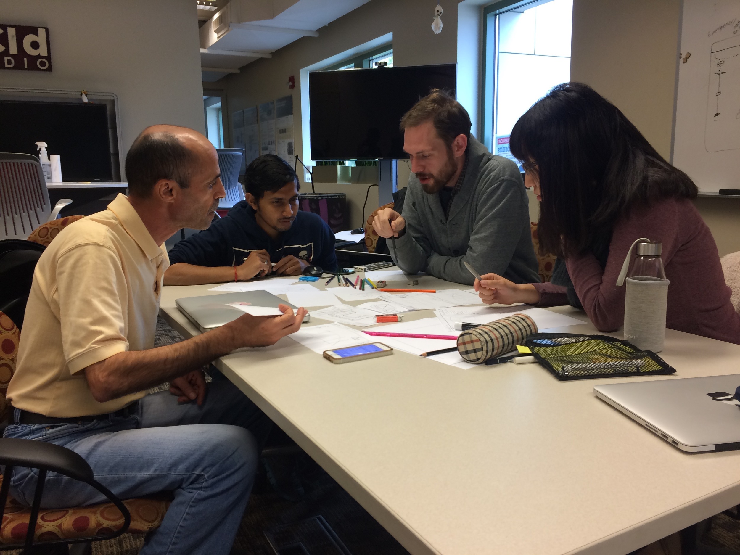
Left to right: Zuheir, Mehul, Myself, Yiying
Primary Research
In prior projects, teams in the cohort were late or more haphazard doing primary research. This time, all teams went out into the community to interview local firefighters early on. To not overwhelm the same 2-3 stations with 13 visits, I worked with other a few other team facilitators to organize trips to different fire stations for qualitative interviews. The group I interviewed with had three teams represented, the other group I arranged for my teammates to go with had another two teams represented. This helped diversify our data. We contributed about 2 hours worth of interview recordings to cohort's Slack channel, where people were sharing their findings. This created issues that only became more obvious later in the project…
INSIGHTS
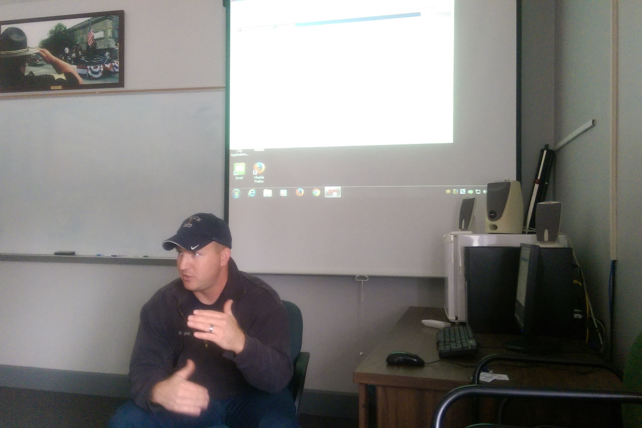
When everyone came back together it meant sharing key takeaways. Because different members had gotten different perspectives, we had to discuss and whittle down what we would tackle. We eventually settled on an issue a Sergeant Gillespie had raised, even though it didn't come up at the other interview with other firefighters (good thing we audio recorded everything!).
After reviewing the data, we decided to define the core of our design as more efficiently delivering the information that firefighters already have. To actually do that, we went off a eventually tied together a few details that came up in interviews:
- They are not quick to adopt new technology that would drastically affect their behavior or approach. This was consistent with our prompt to consider "drift."
- Their existing reporting software had quirks that had never been fixed because of budgetary restraints. The solution we came up with couldn't be too futuristic or difficult to implement if it was going to be viable.
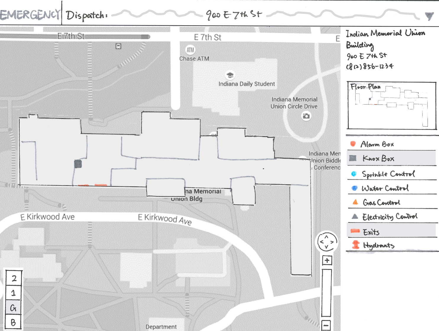
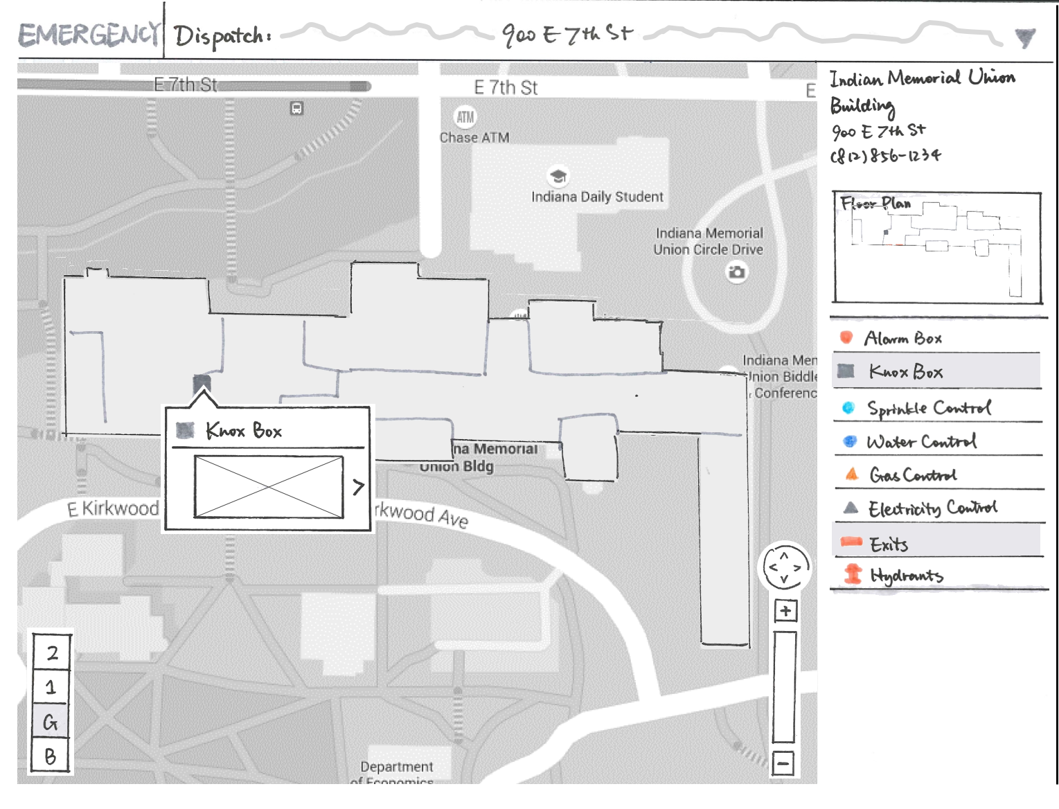
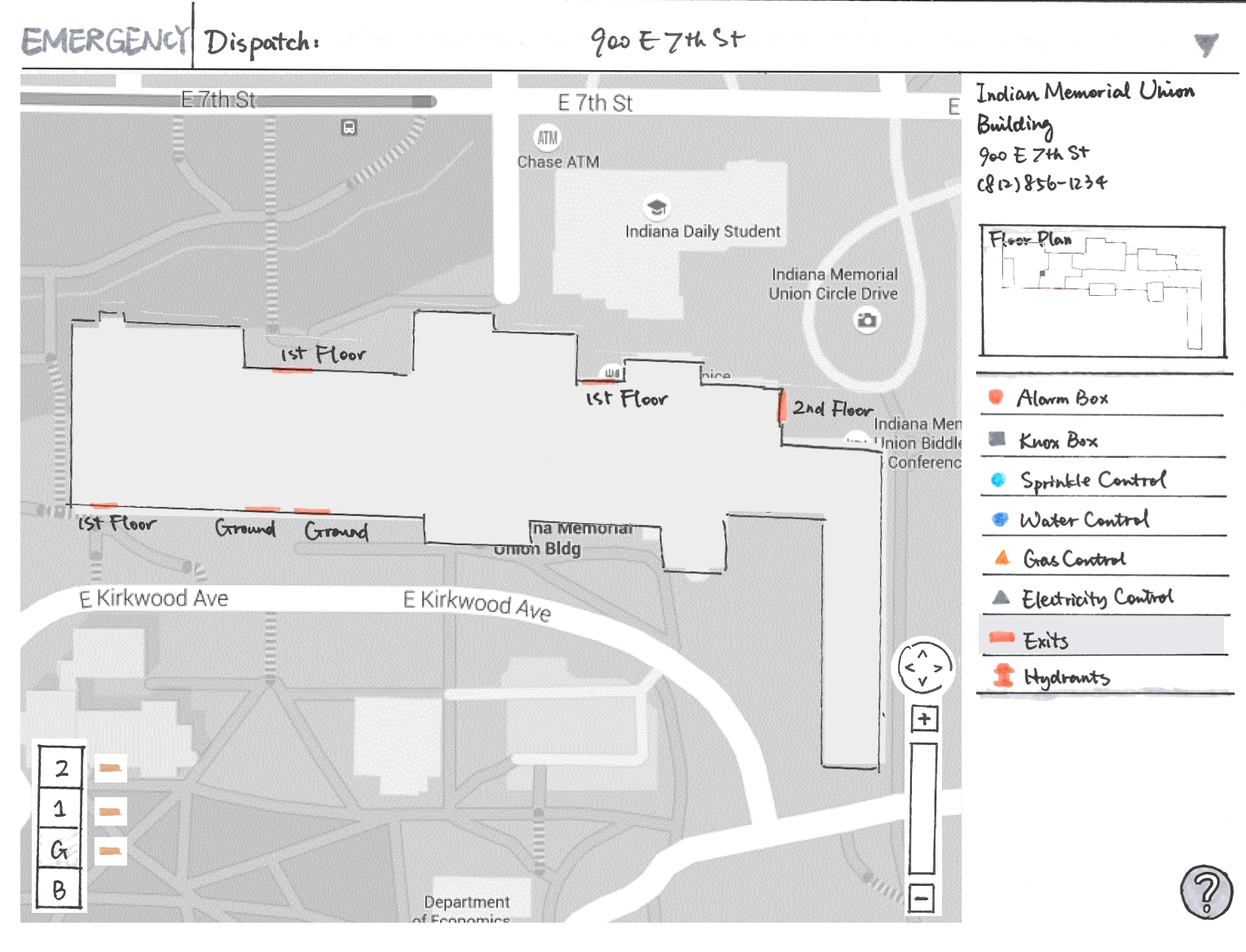
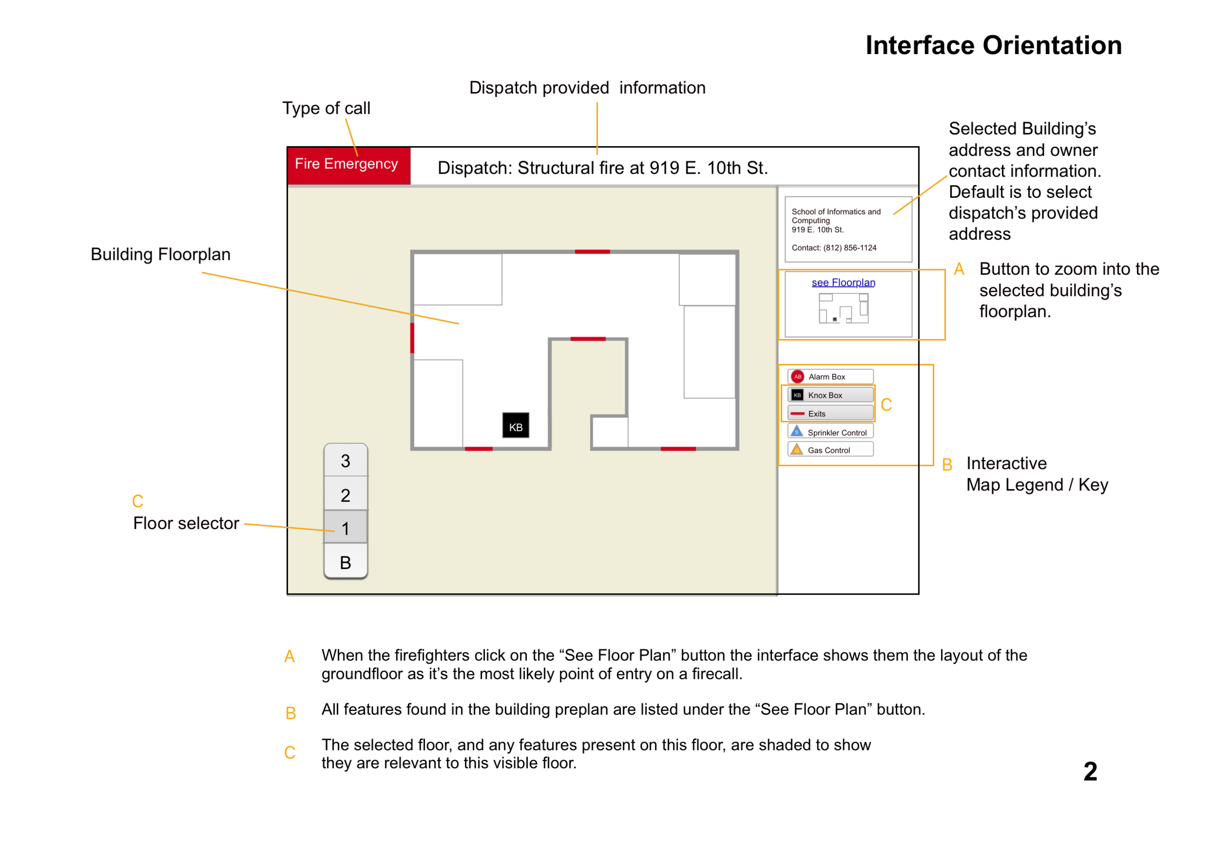
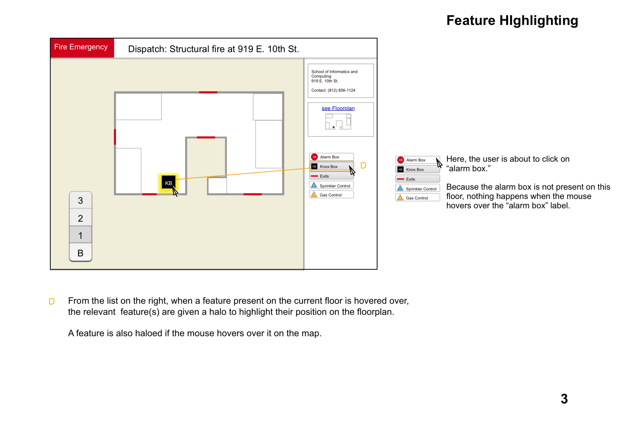
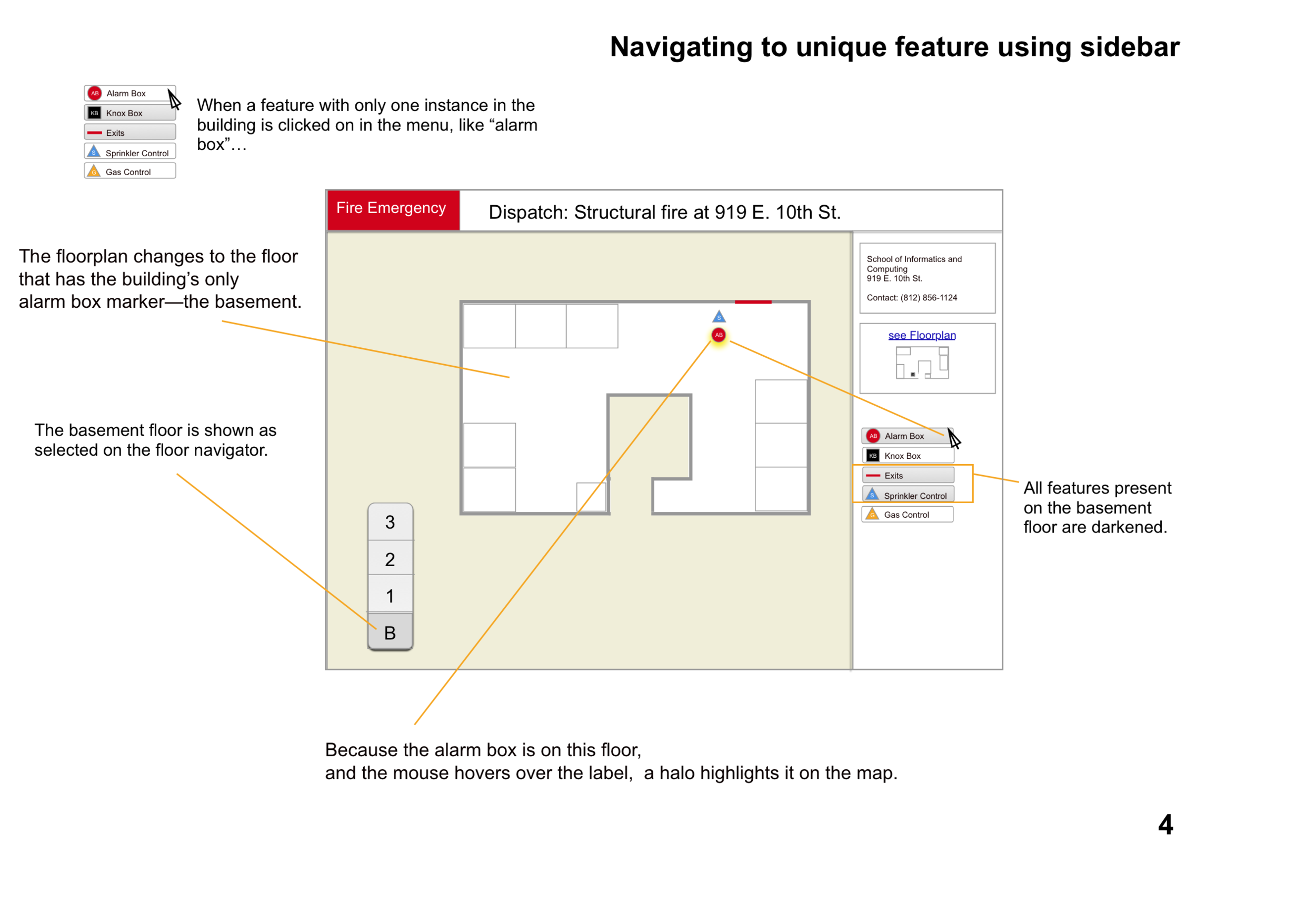
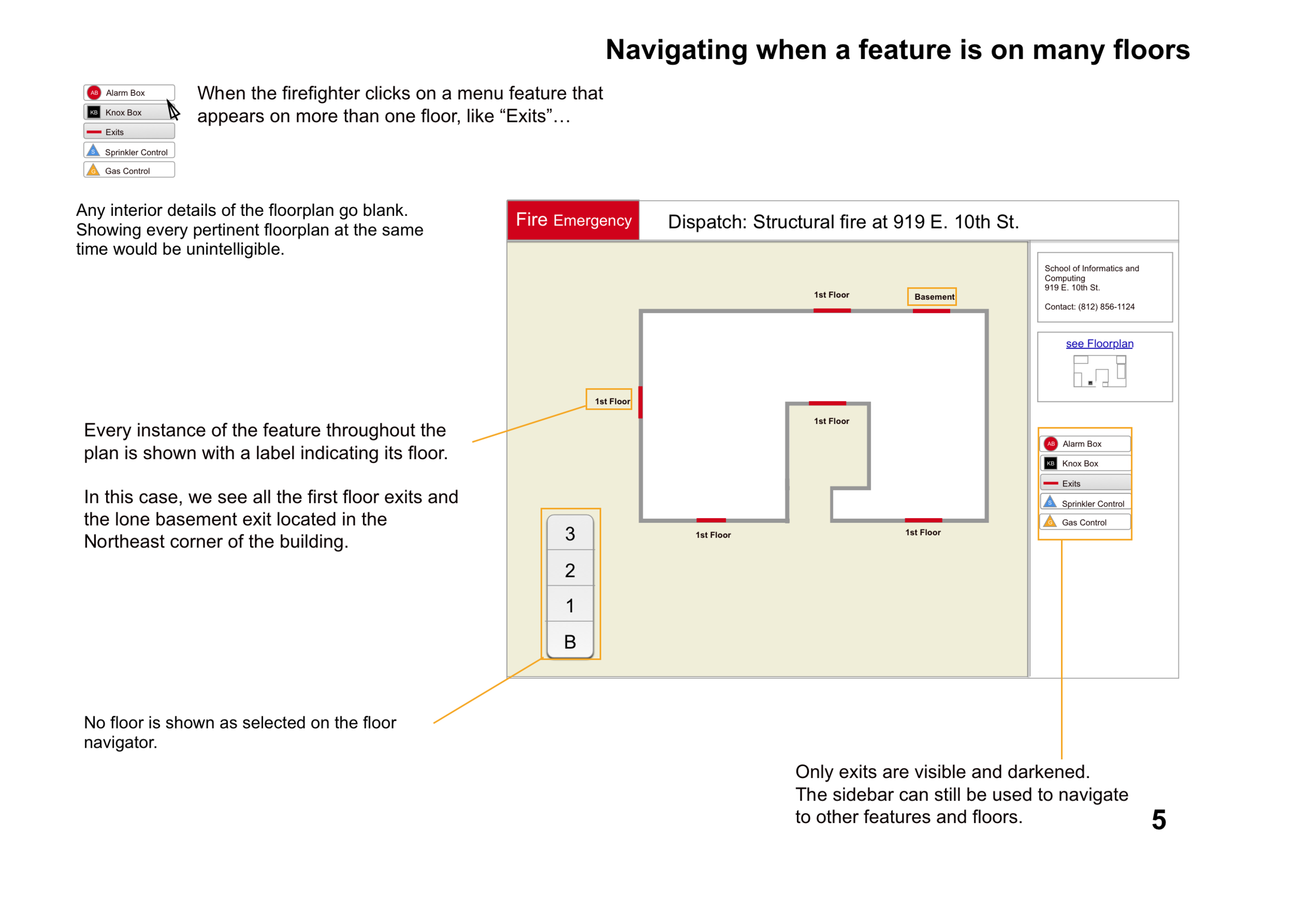
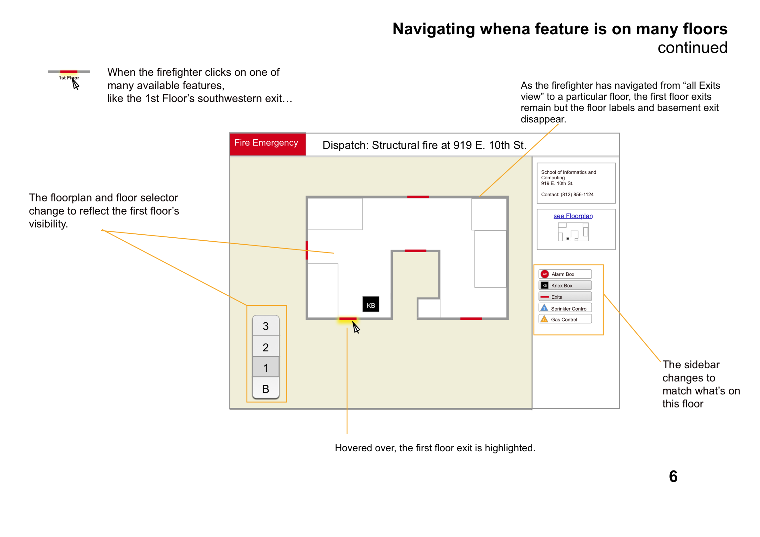
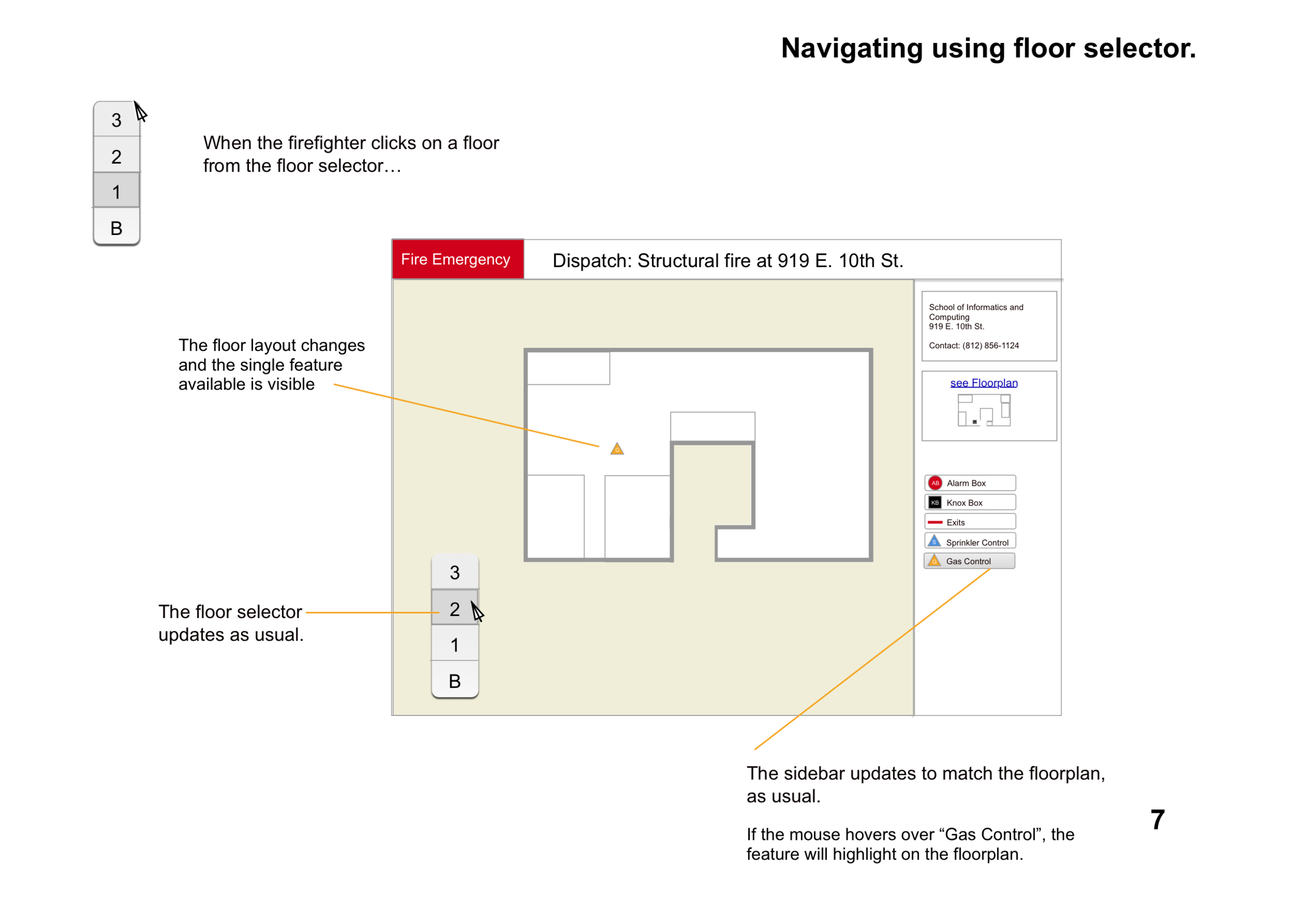
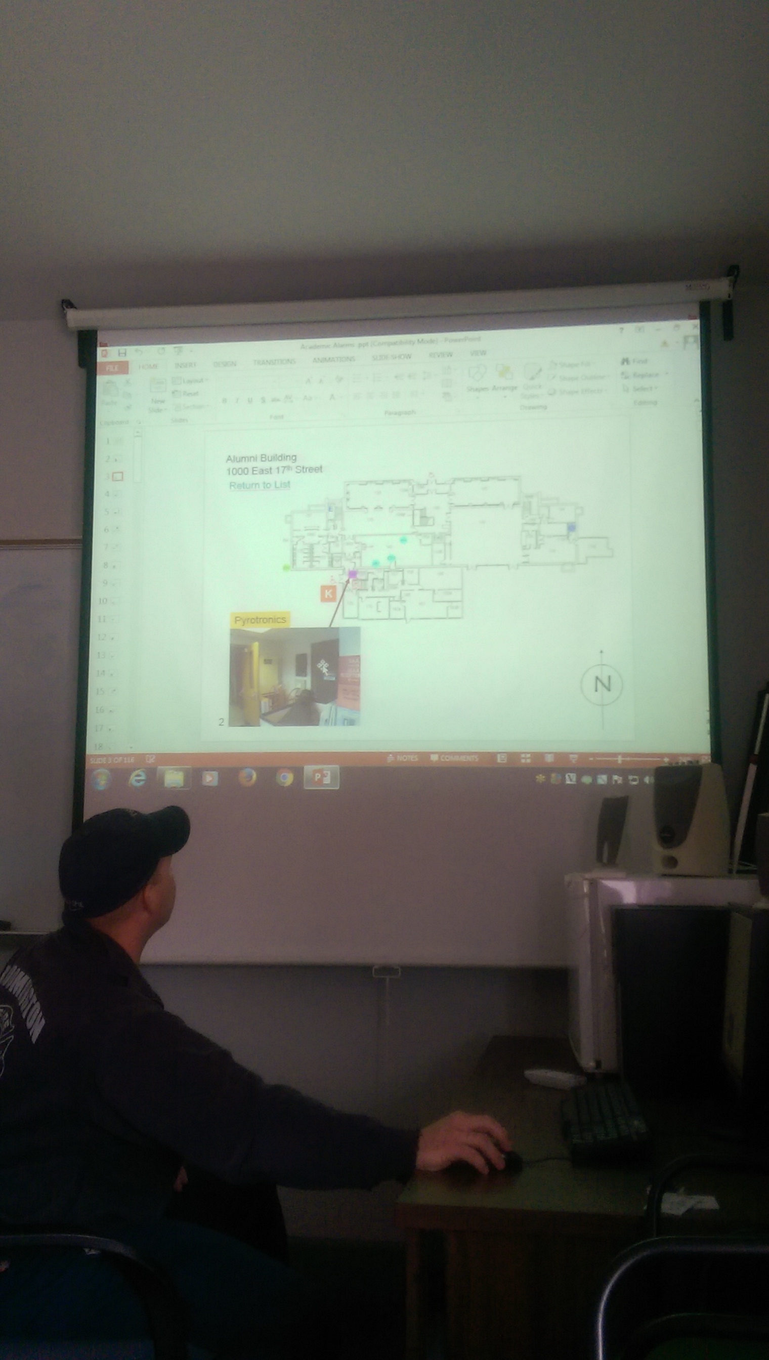
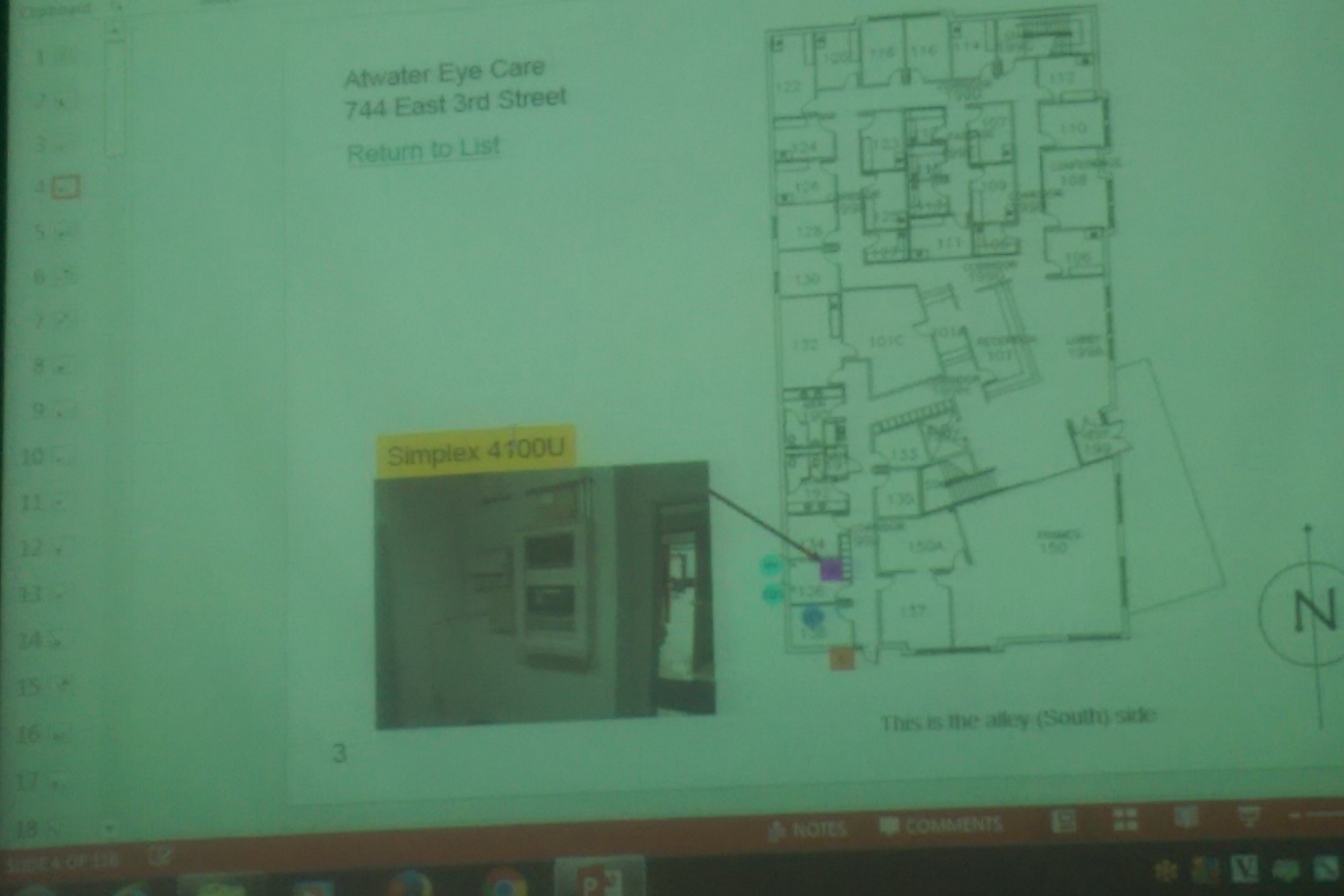
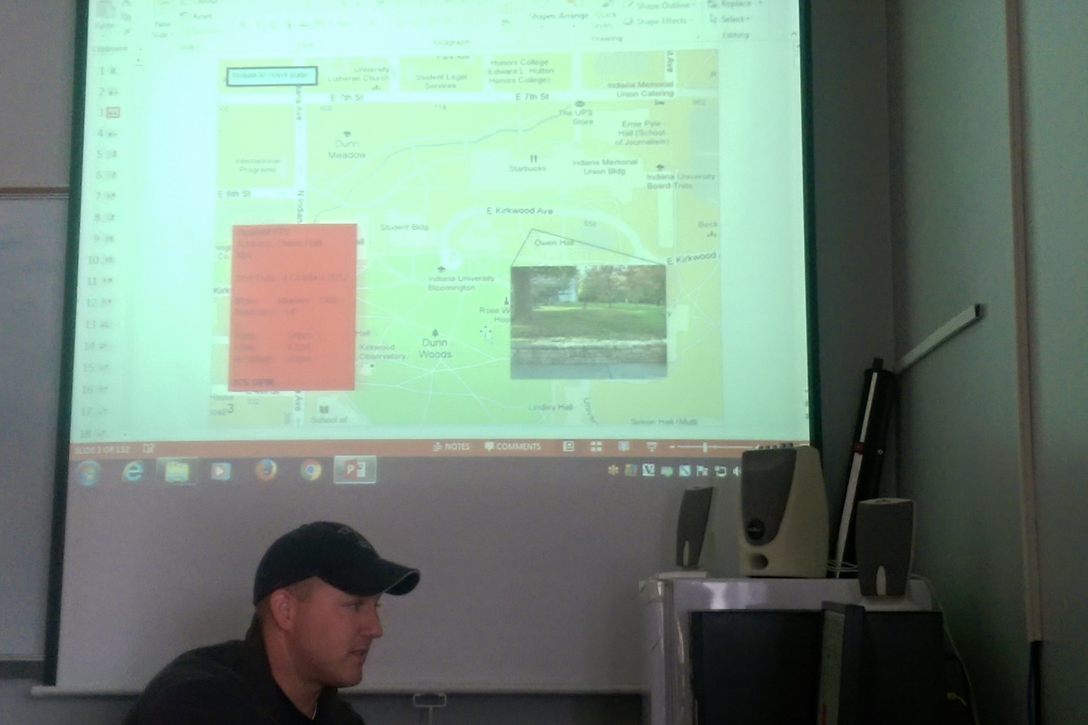
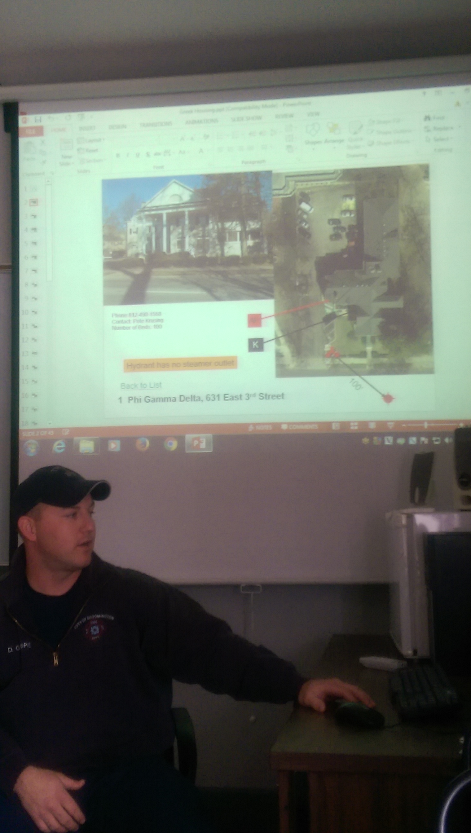
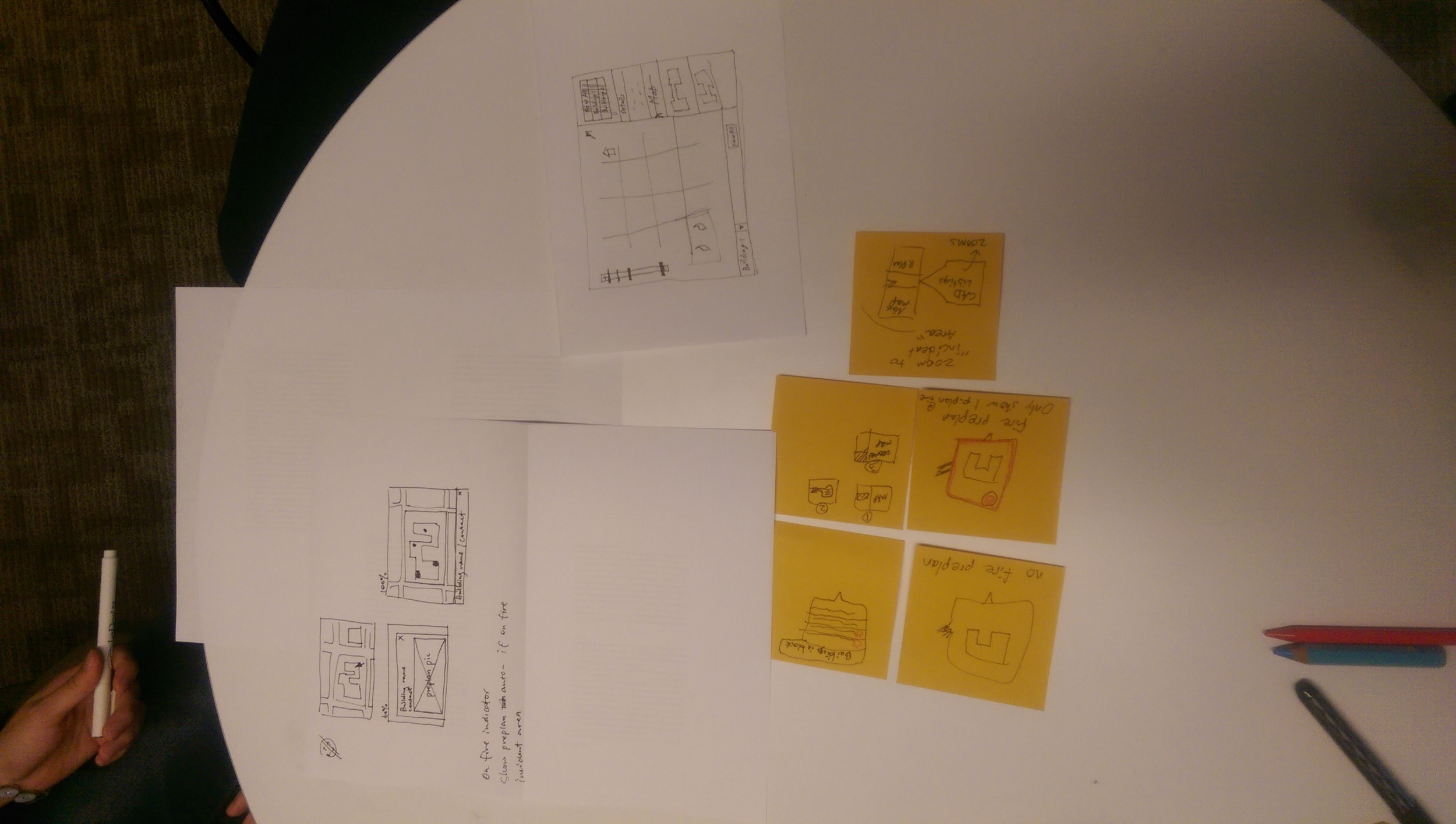
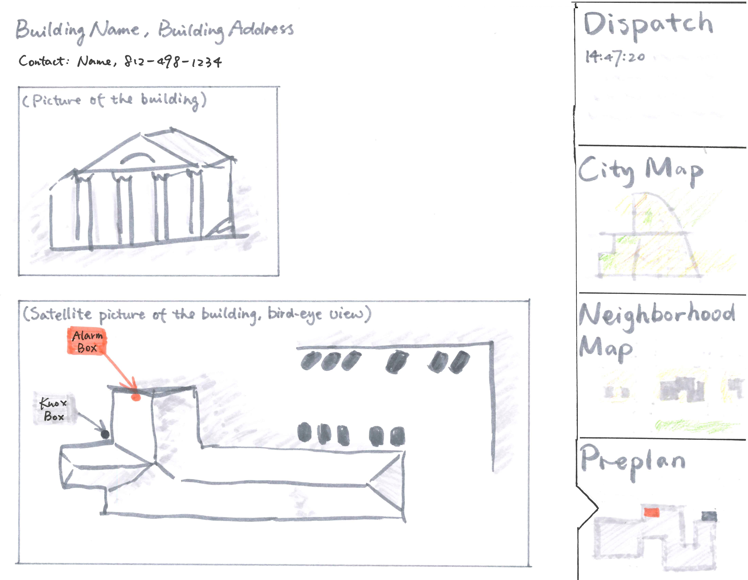
- They manually make and collect annotated maps for larger, more complex buildings. These "pre-plans" indicated key features—safety hazards, master alarm controls, water pumps, and the Knox box that holds keys for the building.
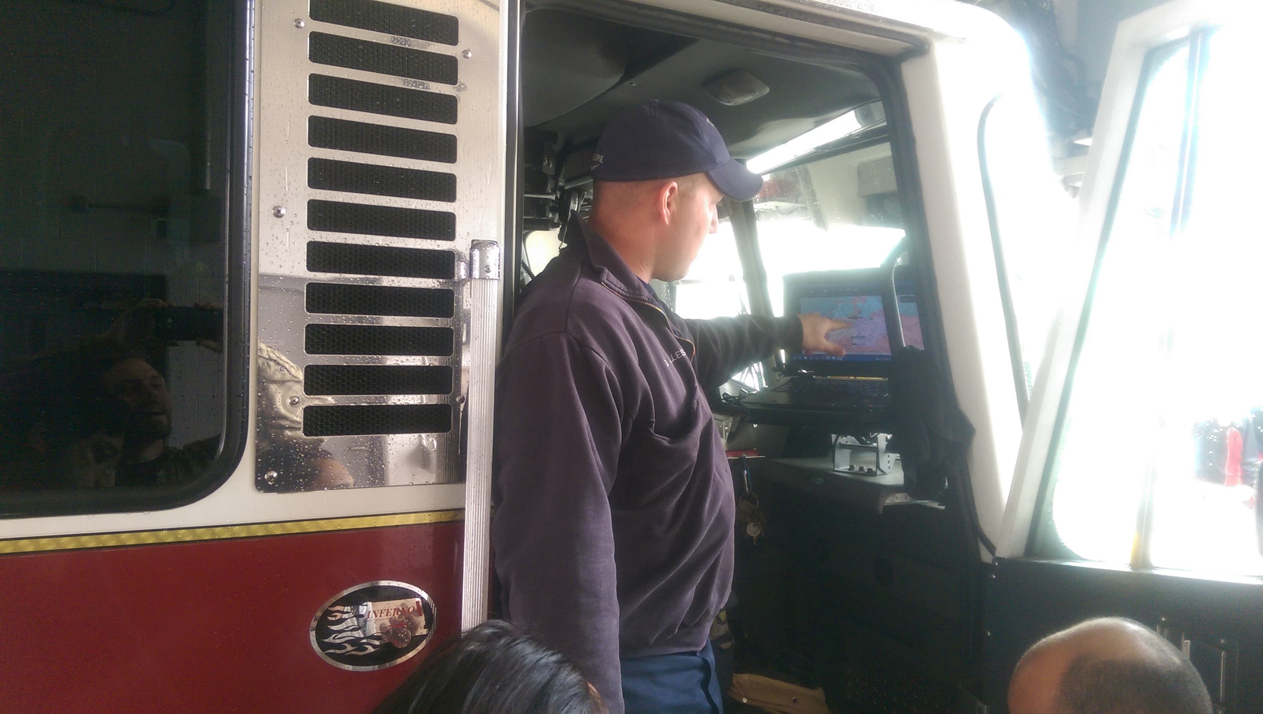
- These pre–plans were assembled and studied in various pdfs, powerpoint slides, and hard copies, but were not readily accessible en route to an incident on their Firetruck laptops.


Concepts
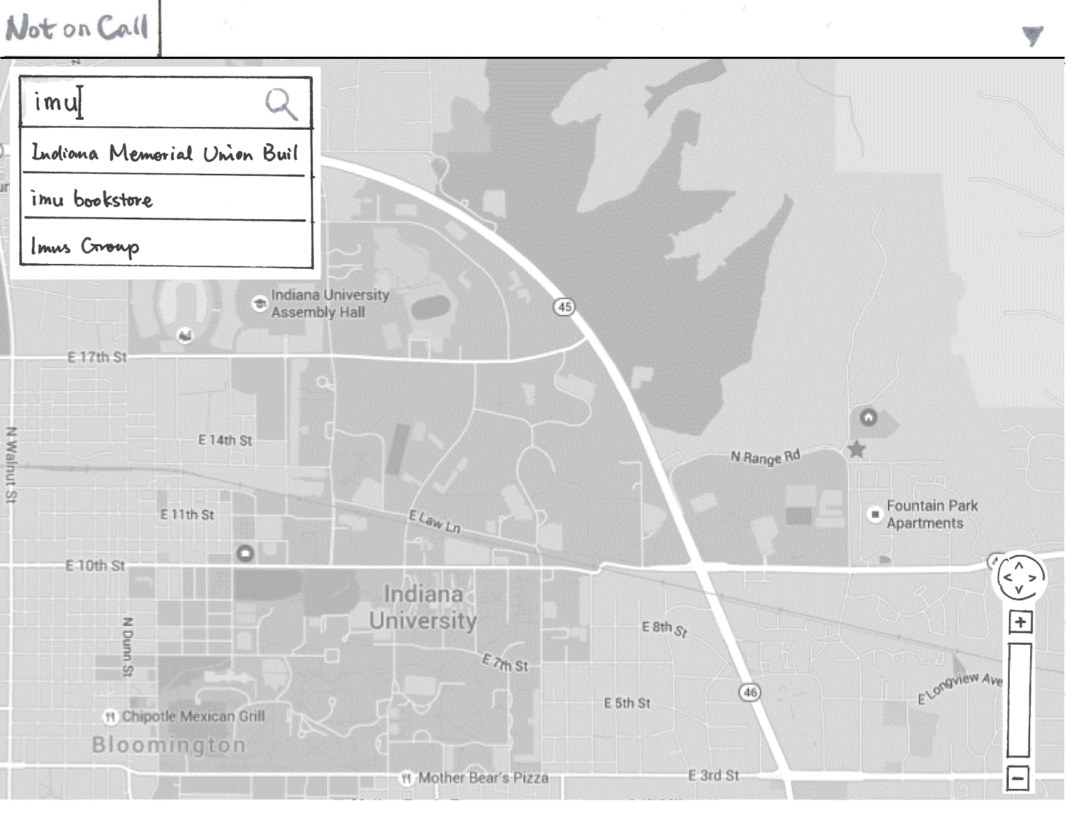
At some point, a potential Resc.Info UI is circulated through the Slack channel. It roughly resembles the map–dominant interface of the Spillman software that Bloomington fire departments currently use.
(To this day, I'm not sure how much of the information we got from our instructor was real or contrived for the exercise as a way to see how we deal with changing circumstances.)
Nevertheless, we used this as a context to house our design. Instead of trying to display every and all kinds of information we would address a small piece of the bigger puzzle.
We wanted to make address's preplan (layout and location of key resources) more readily available. This could be done in a way that could coexist with other solutions.
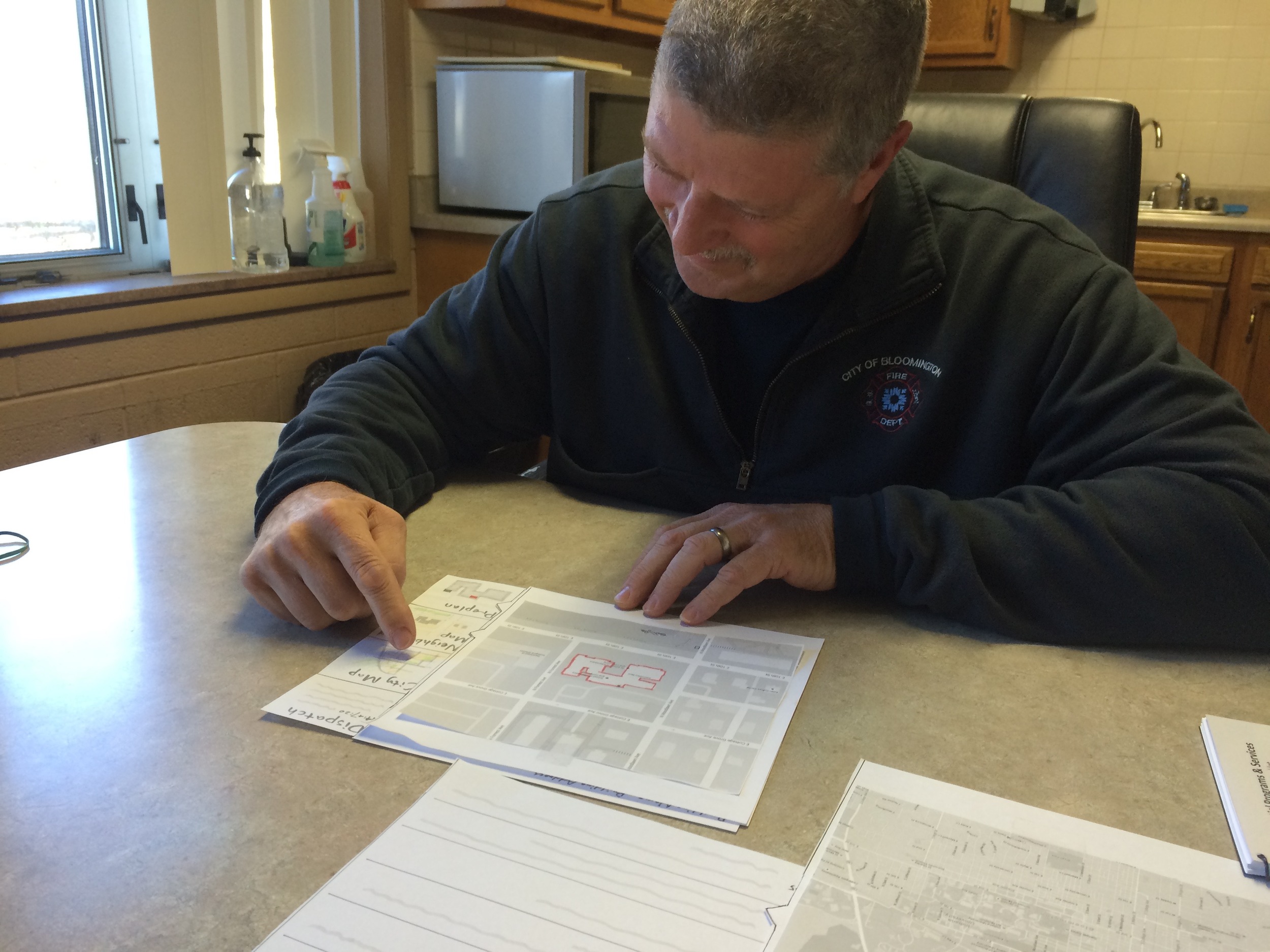
Prototypes and Usability Testing
"Wow it's really intuitive!" or "I've seen one of these before!" ?
Our prototype seemed fairly intuitive…but the firefighter that we caught had done a usability test for another group earlier in the day. He very quickly started identifying and commenting on what he thought the various features were, without being prompting. When asked to perform particular tasks he was able to complete most of them, but thought some views and layout features were redundant. This revealed a few things
- Having the target user is good; it's not so good is when they've already been oriented by someone else's usability test.
- There's a balance and time for qualitative interviews, but they serve different functions from a usability test.
- Other teams had apparently similar solutions…this point was not something we dwelt on much.
Our insight that pre–plans were in small books and pdfs rather than the information system was validated, however. Confident we were on the right track, we went back to sketching revisions that could add more value in less space.
30-60-100
Around this time our instructor delivered new requirements: We'd need to submit three levels of functionality for our design proposal, assuming we could do a minimum viable product, a full fledged version, and something in–between.
This didn't jar us too badly because we had a narrow focus, but we had thorough discussion about how sophisticated we could(n't) make our design. We kept tinkering with our layout and navigation, ultimately decided:
- 30%: the interface preloads the preplan for the address dispatch called in and a button brings up any existing preplan PDF as a reference for key elements.
- 60%: The preplan for building interiors is integrated into the navigation software, the transition between preplan and city map is more fluid e.g. google maps for interiors.
- 100%: The system allows firefighters, when not on call, to directly update an address's map of key features and add notes about them.
Presentation
We rehearsed a variety of presentations, in case we had any curveballs during our presentation, but we didn't anticipate our instructor asking for only one of us to give a presentation, and the rest of the team to handle Q&A. Second–year students picked Yiying to make the presentation of our slide deck and use case movie. There was unanimous agreement that Yiying nailed the presentation; people couldn't tell which parts was originally hers or other team-members'.
While it looked like a map design, it emphasized the basic information that firefighters want going into a fire, not real–time data about their position or other information that could be misleading when the interior is affected by a fire or deterioration. This was relatively well accepted.
On the whole it seemed like a very positive critique except for …
the elephant in the room
We were able to justify how ours was different, but getting past the initial appearance was a big issue. Our design may or may not have been sound, but a majority of preceding teams designs (and critiques) were based on maps, so by the time our group came up there was little to say about our particular solution—Map solutions had been critiqued to death. Big lesson here: sometimes great designs are only obvious in hindsight… many more are obvious from the get–go.
LESSONS LEARNED
- Focusing on commonalities, rather than apparent differences, keep things moving. This was most important working with the other teams deciding on deliverables, giving each some autonomy to go in their preferred direction.
- Good primary research helps ensure a confident problem framing.
- Even though teams had very different cores and nuances, all but a couple teams had designs couched in map interfaces. Were we designing something too obvious? Were we not being creative enough?
- Have the schedule writ large on a board, before the meeting, to focus the group and save time.
- Hashing out the details strengthens trust between teammates' judgement and perspectives. Everyone is also better equipped to explain and defend the design.
- Trust enables smarter coordination for getting massive amounts of work done quickly.
- Can't occupy firefighters for a day of shooting? Make a comic of them. Not a great artist? Trace others' photos and model for them yourself. Don't be afraid to try use and abuse shortcuts as long as it's ethical and effective.
- Iterating different clicks through floor navigation took hours longer than we assumed. "We're almost there, let's keep going!" can go beyond counterproductive. Take care of yourself and teammates.
A video depicting a use–case. I made the video to be shown part way through of our presentation of the concept.